-

ABOUT
Culture Rising is a foresight around trends already shaping our reality, commissioned by Facebook IQ (Now Meta Foresight), a set of tools powered by Meta to uncover where the world is headed.
Through this project we were able to developed a versatile, organized, fresh and dynamic Design system capable of adapting to a variety of editorial needs, resulting in a document easy to read and to implement on range of platforms.
CREDITS
Global Chief Experience Officer, Global Digital Practice - Reid, Taj
Head of Creative Designer - Nathan J Inverson
Head of Creative - Guillermo Valencia
Senior Creative Designer - Sebastian Gonzalez
Creative Designer - Rodriguez, Andres
Creative Designer - Andres Henao
Senior Creative Producer - Llano, Silvia
-
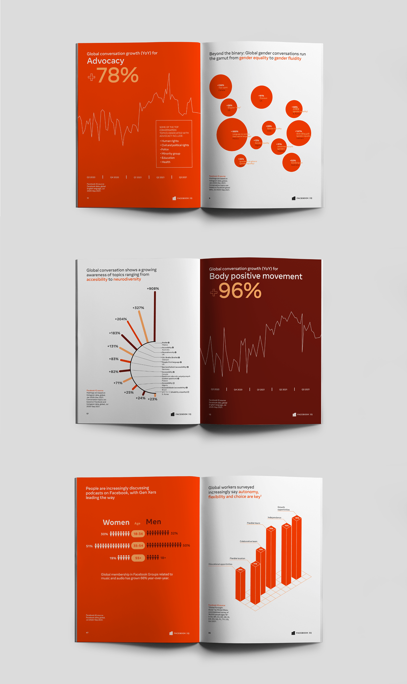
COLOR
This is one of the main elements in our designs, since we use it to organize the content and give dynamism to each page, it is built on different shades of orange.

-
-
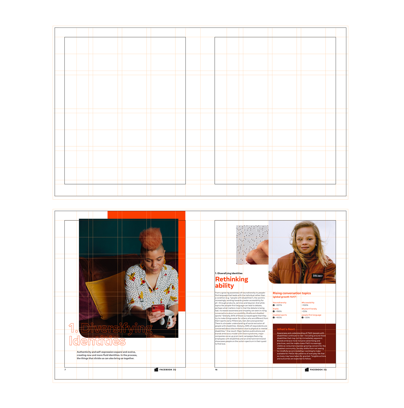
LAYOUT
The intention of overlapping blocks, colors, images and all sort of elements helped us built the most versatile system. One which allowed us to quickly adapt the incoming requirements and changes. As a result, we got a modular, yet coherent visual language. Curves, were the leading elements, clearing the rigid character that comes from vast amounts of content.
-
-

----
EDITORIAL GRID SYSTEM
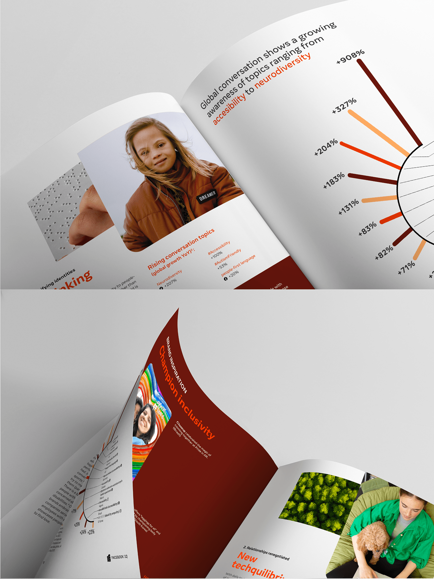
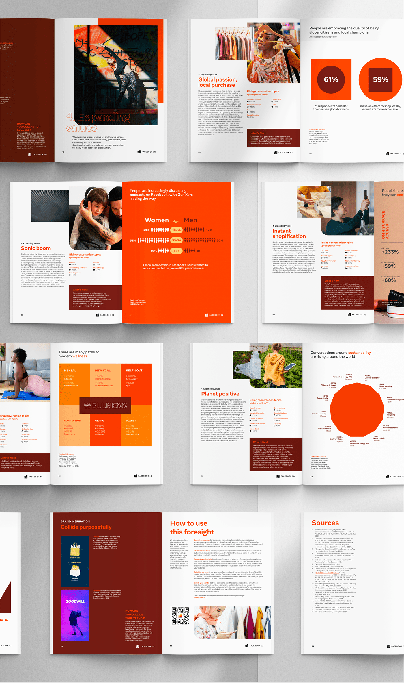
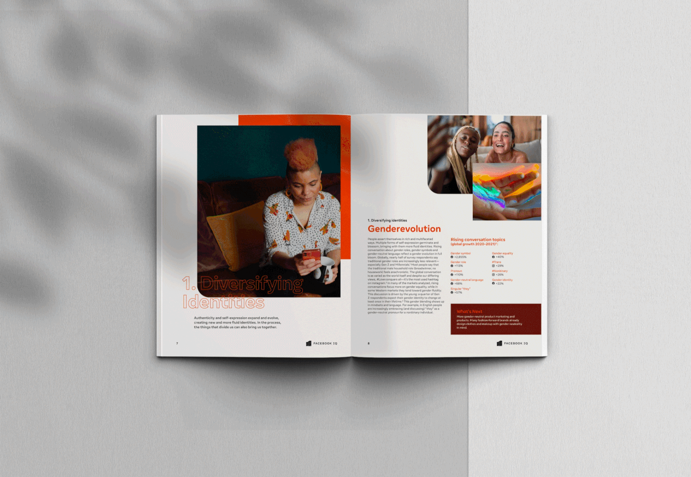
The grid was conceived as an structure flexible enough to accommodate different extensions of text without compromising consistency between chapters. In addition images compensated for the negative space with modules that changed position and proportions. And chapter to chapter intros became a collection of covers displaying powerful images combined with outline versions of the main typography. As a consequence, the document turned out to be an extensive interaction of proportions and contents.
-
-'''
TYPOGRAPHY
Straight from Facebook IQ branding, Optimistic family font proved to be a balanced choice, with a sleek appearance and a great readability. It brought personality to the content without interfering while reading.

-